|
Reference:
► MSH-Branding-Guide-201102.pdf - revised February 1, 2011; current original may be found on the Hospital intranet (if one has access to that file location).
This is Heading 1 (H1)
This is Heading 2 (H2)
This is Heading 3 (H3)
This is Heading 4 (H4)
This is Heading 5 (H5)
This is Heading 6 (H6)
This is Normal (P)
Standard Colours are described on a separate page: <?page=Standard Colours>
Standard Webpage Skin
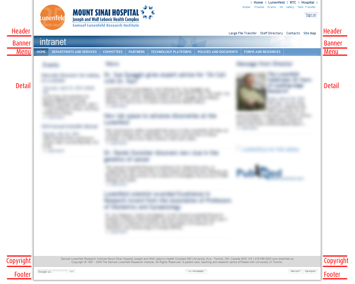
(Mandatory elements are identified here by underlined, bold text. The image below is for reference only, to help visually identify the sections of the template; it is a snapshot of the intranet home page.)
The Lunenfeld-Tanenbaum Webpage Skin template positions the content block horizontally in the browser window.
The preferred inner width (the space between the shadow outlines) is 970px. However, depending on the content of your Website, the inner width may be either 770px or the 100% of the total widths of the browser (in which case there would be no shadow border on either side of pages).The Lunenfeld Webpage has several standard and required elements:
- When narrower than the browser window, the Webpage is outlined by a shadow on both, left and right side and at the bottom.
- The Header section consists of white space with the following details:
- In the left portion of the header is the current Lunenfeld logo. Webpage editors may make their lives easier by linking the source of the logo image to its location as indicated in the suggested piece of code rather than copying it locally into their Websites - should the image of the logo change, the logo on all Websites linking there (rather than embedding the image) will be updated immediately.
- The positioning of the logo and the amount of margin around it as well as the minimum size of the logo immage are dictated by the branding guidelines from the Hospital Graphics and New Media Department.
- The minimum height of the header section is dictated by the size of the logo image.
- The right portion of the header section may be used for several sets of shortcuts relevant to the Website.
- The image of the logo should comprise a coded hyperlink area leading back to the Lunenfeld main Website at http://www.lunenfeld.ca/.
- The Banner element is an optional decoration. However if absent, a thin line should enclose the header section.
- The Horizontal menu content depends on the Website. The appearance of te menu may resemble the menu applied to the main Lunenfeld Website with evenly-sized buttons or proportional buttons like on this Website.
- The Detail section is where the content of the Webpage is displayed.
- The Copyright section must be displayed exactly as shown in the example. This is a mandatory element.
- The Footer section should have similar appearance to that in the example. It's existence is mandatory but the content depends on the list of technologies used to display the Site.
|
